
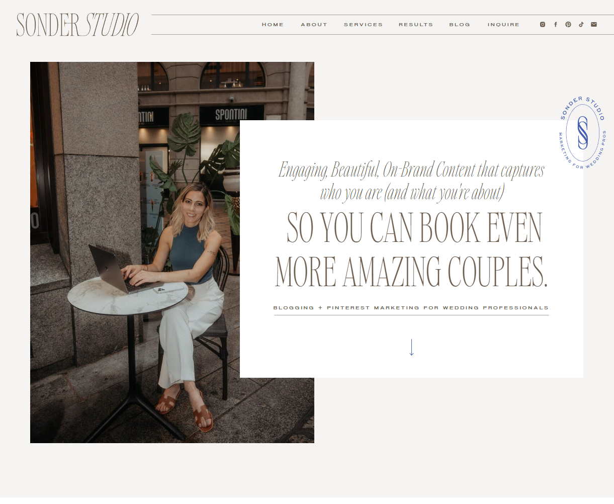
Something I’ve found from years of working on websites is that there is ALWAYS something to improve. Even the best websites out there have something about them that could always get better. Remember, you may have a pretty site but that doesn’t mean it’s working for you.
Before you complete a website audit you will want to establish WHO you’re trying to reach and the top goal of your brand’s website. Are you trying to get people to schedule a call? Fill out your contact form? Sign up for your email list? Have this goal firmly in mind when you start the process and that will illuminate the way!
Are you ready? Then let’s get started on the website audit checklist.
Step 1: Track how users interact with your website.
Are you running any sort of user metrics on your site right now? Most people will say that they’re running Google Analytics. That tells you how many visitors you have, where they’re coming in from (social media, Google, direct links, etc.), what your bounce rate is, and even, if someone’s on your website right now. You can also see which pages are most-visited.
But there’s an even better way to track how your users interact with your site and where they’re leaving the page. They’re called heatmaps. I use a tool called Hotjar (which has a completely free plan that lets you track like 2,000 visitor recordings), which you can install in the header code of each website page you’d like to track. There are move maps, scroll maps, and click maps. I’ll go into detail about each one here.
Move maps
show you where readers are moving their cursors. You can see which sections people are following along with their cursors. This is great to know which sections are really high-impact.
Scroll maps
show you how far readers scroll down the page so you can see what percentage make it to the end. This is helpful so you can know which information needs to be moved earlier on the page and what information is lower-priority and can be moved towards the bottom. For example, if your primary goal is to get your reader to contact you about working together, this would be higher on the page. But an email signup would be closer to the bottom since this isn’t the primary user goal.
Click maps
show you where your users click. You can see which call to action buttons are hot & where people are clicking on your navigation. You might find that the expected areas are hot with lots of clicks. But you may also find that your calls to action aren’t where they should be to catch your user’s attention.
Something you can also do is look at User Recordings, which are actual recordings of your visitors using your site. You can watch them to see what a user’s experience is so you know where they enter the site, where they scroll to, and even where they completed an action or abandoned the page. This is EXCELLENT for shaping your site to be what it needs to attract your dream client!
If you’d like to dig into this further, I have a freebie you can check out!
Step 2: Take a closer look at your headlines. Do they really show who your brand is, what it does, and the clear benefits of working with you?
I get it. Headlines are hard. But they’re the thing that people read the most. You may find that the serial scrollers on your site aren’t reading as much of the body copy as you’d like, but you can count on the headlines factoring in for sure.
You may be really tempted to sound clever in your headlines. But this isn’t everything in copywriting. Being clear really can be better, and the data supports that. If people are confused and aren’t quite sure what it is that you do, they’re going to jump ship.
If you haven’t done so, this is a great time to revisit your brand’s one-liner and mission statement. Although you may not want to use these as the first line people see on your website, you can definitely borrow bits and pieces and find a way to incorporate them into a headline. You may also consider surveying your audience and making sure you’re up-to-date with what they need and what they’re looking for from your brand.
Start with one page at a time, and read the headlines carefully. I would say for each section you’d want to try out at least ten different headlines. Just sketch out different alternatives highlighting different benefits and see which one resonates. You can test them out by seeing how they perform on heatmaps over weeks and months and then tweak based on this.
If you’re struggling with your homepage headlines, try these out!
Step 3: Take a closer look at your calls to action.
Calls to action are VERY important on a website. Something to remember here: It might feel repetitive to have lots of calls to action on your site. You may feel strange because it’s asking for the sale, and in our industry there’s a lot of reluctance around feeling salesy. Think of it this way: people are coming to your site WANTING what you have to sell. They WANT to be sold to and you’re simply pointing them to the desired action so they can engage with your work further. I guarantee that once you do this you will see more email sign-ups, more clients, more ideal prospects.
You’re creating an experience on your website, and every reader on your site will have a different experience. This means that while many people will start on the Homepage, there are lots of people who will jump in on your blog, your about page, your services page, etc. So you need to have the information required to complete the desired action on each page so you don’t lose readers you could have connected with. Some people will read every word and scour your site, many will skim, read only certain sections, and skip right to the desired action. It truly depends and you have to create a site that accounts for these things.
Here are some questions to ask yourself:
Are your calls to action between 3-5 words? This increases conversions. If you make your buttons too long, data shows that users drop off. Keep ‘em short and to the point!
Are they on-brand and action-oriented? It often works to have an action verb in your call to action like “get started now” “download the checklist”, etc. While sometimes they can be practical and to-the-point, you can dress up something like “Contact Me” to “Yes, Let’s Do This!” or “Book My Free Call!”, depending on your goals.
Are they prominently highlighted with a colorful button? Make your calls to action stand out with visual cues. This means bright buttons and prominent visual hierarchies. Your headlines should look like headlines, and your calls to action should look like just that– a call to take an action.
Is your navigation clear and easy to find? If it’s not being clicked, you’ll know your users are having a hard time finding it.
Step 4: Make sure your service descriptions fully reflect the value of the offer.
When it comes to your services page, it’s SUPER tempting to feel like you need to make it short and sweet. This can work in some industries. But if you have content that runs longer, this isn’t necessarily a negative thing. Your service page definitely needs to speak to the prospect in some way, pulling on those pain points, letting the prospect imagine what it would be like if they had your transformation, and showing them the benefits of working with you. You’ll also want to show the full value of your offerings by doing just that: packaging your offerings.
Now there are a lot of ways to show pricing on your website. My clients are always asking me what I think… and this really depends. I know of a lot of photographers and wedding planners who do dynamic pricing, meaning that they have ranges and starting prices, but their prospects really need to get in touch to see what a custom package would look like for THEIR wedding day.
I have other clients who, like me, have package pricing clearly listed on the site, and pretty much, that package is what you get when you reach out. If your site is 5 pages, then that’s the price for the work. Things can be taken out or added on, but that package price shows everything that’s included so your prospect knows what they’re getting with you.
There is an argument to be made for not listing pricing and having prospects reach out… but in my experience, it’s generally a good idea to give people an idea of what you’re offering for what sort of price, even if it’s a range. Otherwise, you may have more people reaching out who aren’t in your budget range and aren’t able to work with you at this time.
As far as listing out what is included, try to really hit on the high-value components of the offering. Don’t obsess over smaller things you’d probably throw in as a freebie anyway. For example, in my offerings collaboration with a client’s web designer or brand designer is always included, but I don’t list this as part of the package because it’s not the highest value add that I can give my client. I list the other things, the biggest components that really will give them the most impact.
When you’re revisiting service descriptions, think carefully about what bullets to include, examine the way your pricing is structured, and make sure it’s clear and direct. But, again, don’t be afraid to take your time in speaking to the prospect. Don’t make your services page just a price menu. They can reach out to you or even put in their email to get something like that.
Step 5: Improve your SEO & User Experience.
Do you struggle with optimizing your site for SEO? You’re not alone! Most creative business owners struggle with this element of their website.
First of all, do you know which keywords you need to rank for? You’ll want to try and do some keyword research. Here’s a post about SEO to get you started, and we’ll definitely cover this in future podcast episodes!
For now, I’m going to encourage you to make sure those top keywords are where you need them to be on your page. A great rule of thumb: don’t try to keyword stuff by putting them into every nook & cranny of your website. This is NOT a good idea. Weave them in naturally. Generally, you’ll want to stick to 1 instance in your main (H1) headline, again in your H2, and where it feels natural in body copy, much like when you’re writing a blog post. Again, super key here: keep it natural!
There’s always a balance to strike between SEO and writing for people, and it’s super important not to abandon the second one just because you want to be found on Google.
As far as USER EXPERIENCE: you’ll want to intuitively analyze your site. If you’re struggling to see it objectively, the heatmaps can help you out here. The key thing: your prospects need to be able to find things on your site. There shouldn’t be anything that’s super difficult to find. If it is, find a way to ease the struggle so more people can complete that desired website action. Take a careful look at your site. Is there text overlapping each other? Does the mobile site look right? Is your navigation easy to find? Do you have a contact form?
That wraps up the website audit checklist!
On the other hand, if you’re not reaching ideal clients and see that even after doing this your site really isn’t working or you’re just COMPLETELY frustrated with how your brand looks, feels, and sounds, it may be an indication of something more serious: a rebrand.
How do you know you need a professional opinion?
You’ve tried writing your headlines but you’re completely stuck.
You’re not quite sure what your brand statement is or if it even works.
You’re having a hard time interpreting your heatmaps data.
You’re struggling to do SEO keyword research and implement the right words, naturally.
You feel like you’re being TOO salesy or not salesy enough. You need just that perfect balance.
You want to convert but don’t quite know how.
Not sure your website has these things? Sometimes it’s hard to be an objective judge of our own websites. Click to learn more about working together right here.


")
")


